CI
Symbol Mark

Eco-friendly & smart ship fieldEco-friendly & smart ship field Eco-friendly & smart ship fieldEco-friendly & smart ship field
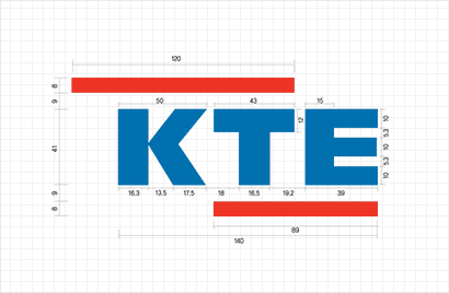
The symbolic meaning of KTE's word mark is the image of a challenging spirit and hopeful vitality for the future of the company through two dynamic lines, and red means powerful vitality and intense energy. It also implies infinite possibilities for becoming a world-class company and a the united will of labor and management through a stable blue logo.
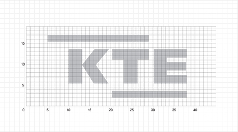
The word mark developed to secure the unity of the visual image requires special attention in their use as they are intended to create a sense of unity among the members of the company and and to deliver a consistent image of KTE in communication with customers.
The symbolic meaning of KTE's word mark is the image of a challenging spirit and hopeful vitality for the future of the company through two dynamic lines, and red means powerful vitality and intense energy. It also implies infinite possibilities for becoming a world-class company and a the united will of labor and management through a stable blue logo.
The word mark developed to secure the unity of the visual image requires special attention in their use as they are intended to create a sense of unity among the members of the company and and to deliver a consistent image of KTE in communication with customers.
Signature
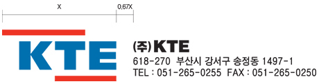
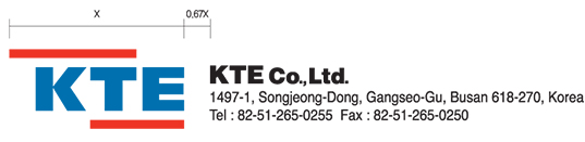
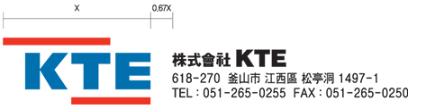
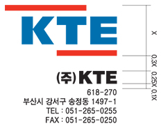
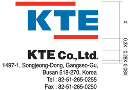
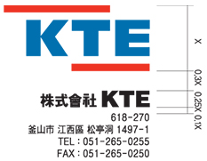
Horizontal Combination
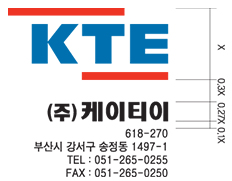
Vertical Combination
Color System
Main Color
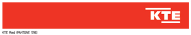
- KTE Red 0114
- PANTONE 1795 / DIC 157 M 100% Y 94%
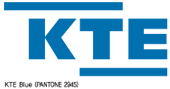
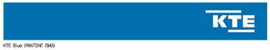
- KTE Blue 1062
- PANTONE 2945 / DIC 579 C 100% M 63% Y 5%
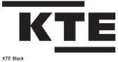
- KTE Black
- K 100%
Sub Color
- PANTONE 5793 C 5% Y 20% K 16%
- PANTONE 642 C 18% K 6%
- PANTONE 3275 C 95% Y 47%
- PANTONE 2925 PANTONE 2925
- PANTONE 877 C 46% M 38% Y 36% K 4%
- PANTONE 874 C 41% M 47% Y 77% K 7%
Color Utilization